Redesigning PenFed’s Multi-Product Onboarding Application Flowv
Building a scalable, mobile-first onboarding system that can flex across deposits, personal loans, and auto loans, regardless of platform.
.jpg)
Overview
PenFed’s onboarding applications for deposits, personal loans, and auto loans were inconsistent, complex, and difficult for users to navigate. I redesigned the entire experience to create a mobile-first, unified framework that improves clarity, reduces friction, and scales across product lines while remaining flexible enough to support future platform or technology changes.
Objectives
The Challenge:
Designing Through Platform Uncertainty
A critical technical constraint was not knowing which platform would power onboarding long-term, so I’ve had to design a universal framework that is modular, componentized and adaptable across product lines.
Platform-Agnostic Solution
This approach enabled the design team to keep progressing despite uncertainty, creating a framework that could adapt to any technical decision.


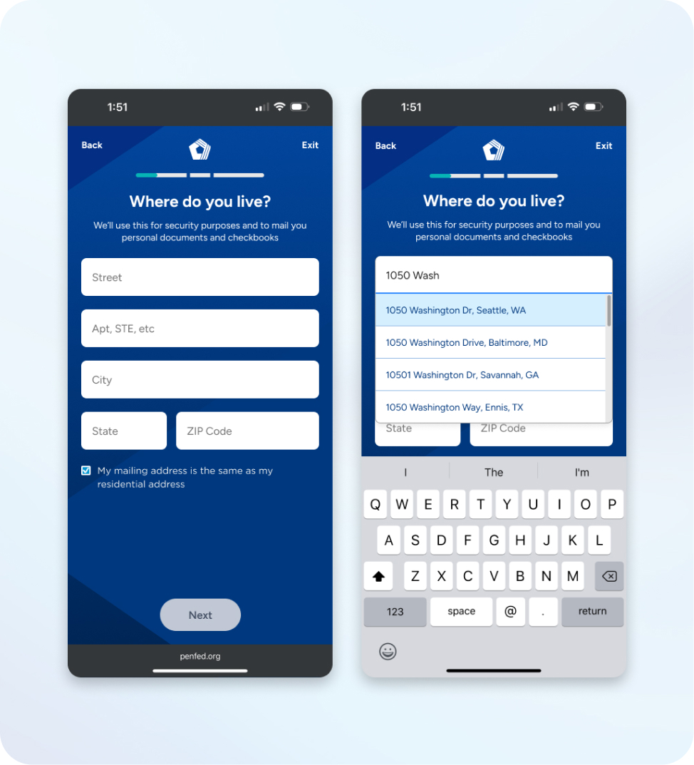
Research & UX Audit
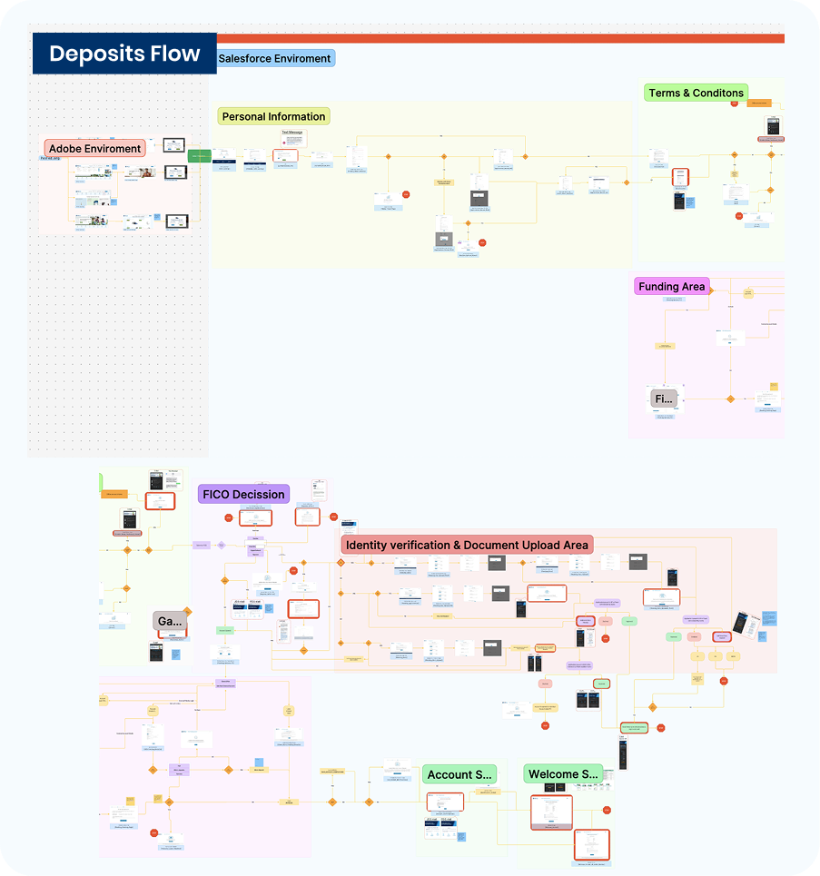
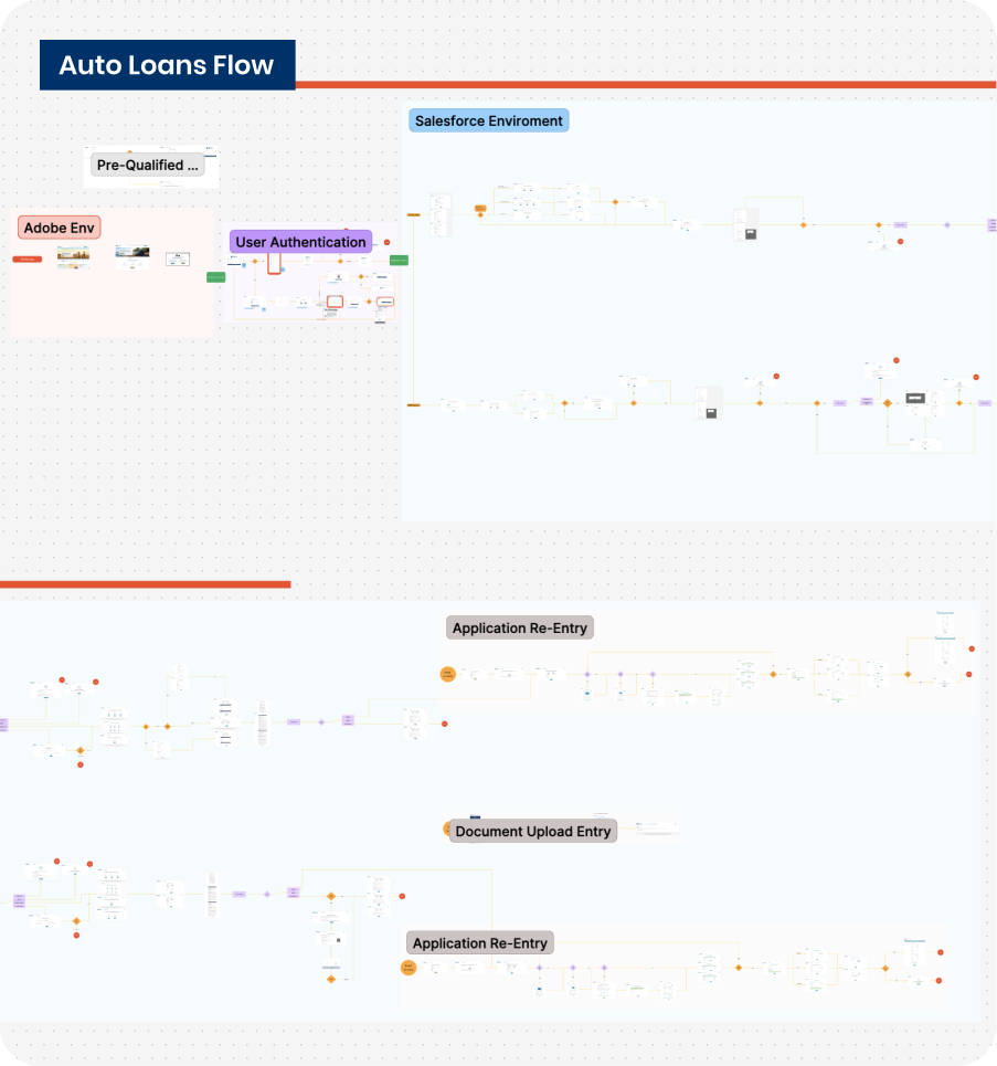
I began with an in-depth analysis of the deposits application flow, then expanded into personal loans and auto loans as it became clear that all product lines shared similar friction points.
What We Asked:
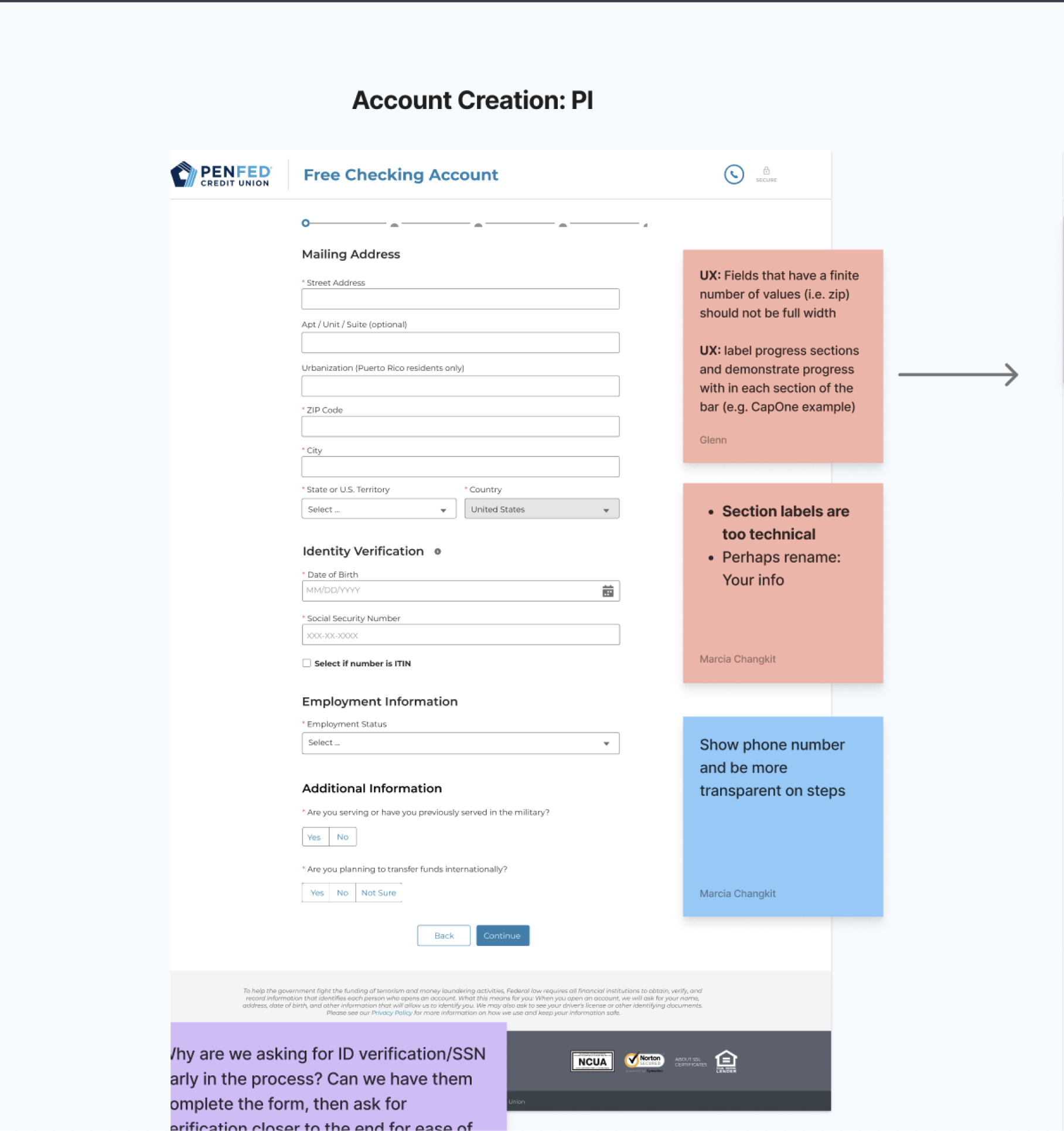
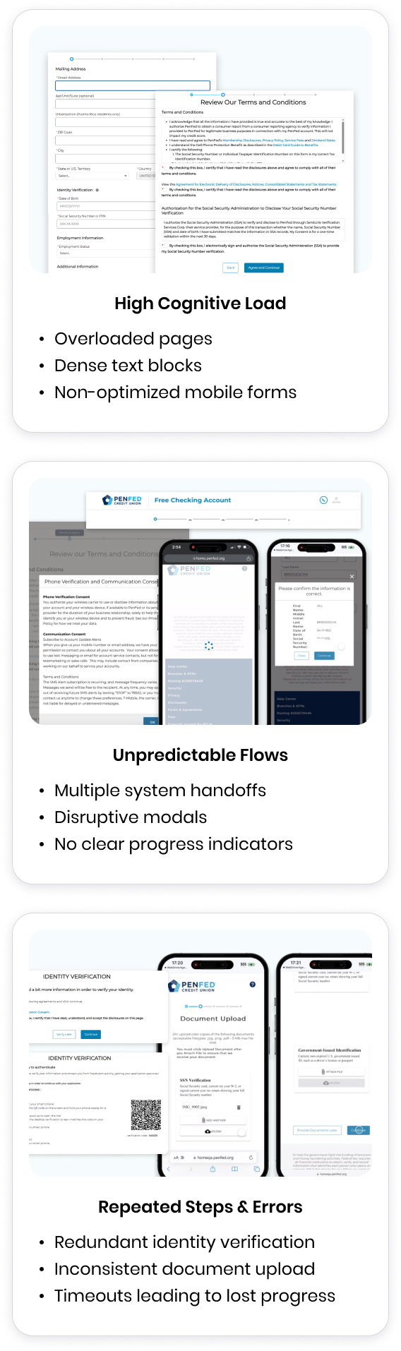
UX Pain Points
Users Struggled with:
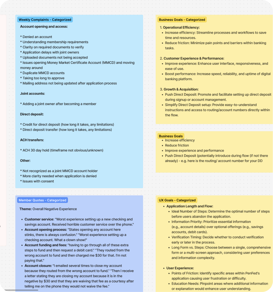
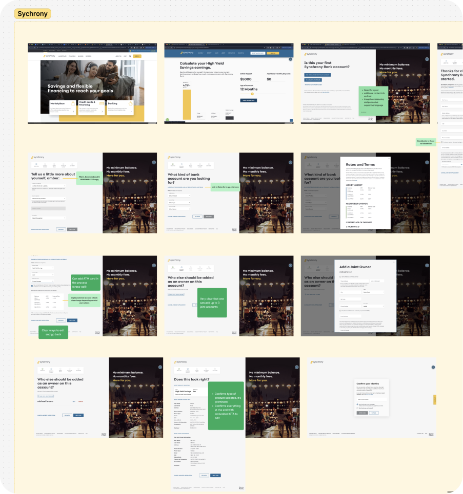
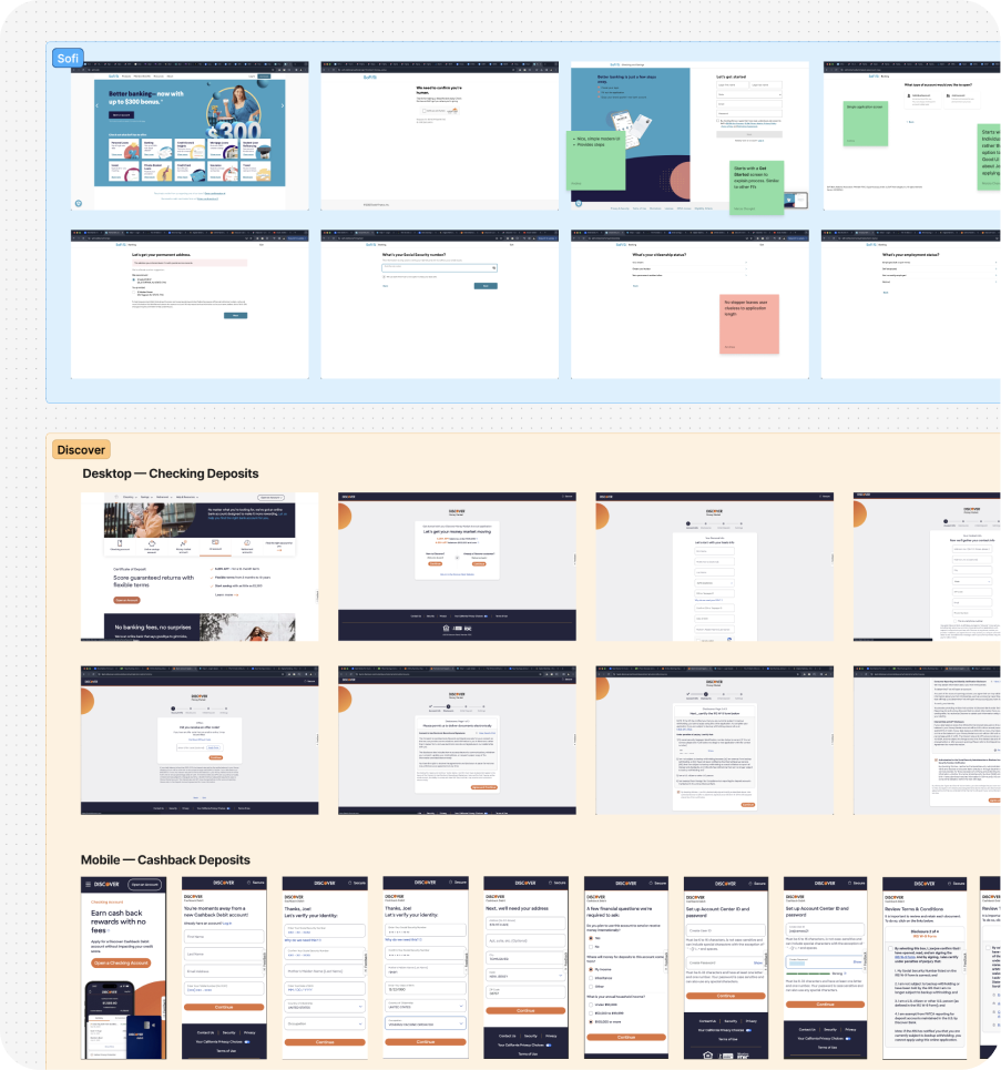
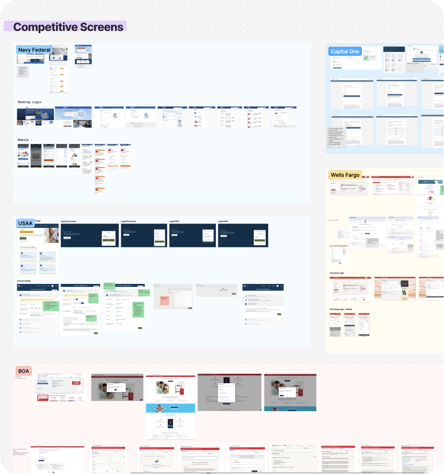
Competitive Findings
Competitors like Synchrony, SoFi, Discover, and Navy Federal consistently offered:
Competitive Findings
Competitors like Synchrony, SoFi, Discover, and Navy Federal consistently offered:
29% of non-member digital Free Checking applications drop off before submission
Drop-Off Analysis
To validate the qualitative findings, we analyzed Salesforce data reports for all non-member digital Free Checking application funnels to hone in on where users frequently dropped off.
Key Drop-Off Moments

Current UX Problems
Drop-off data revealed major friction points aligned with cognitive load, verification steps, and legal disclosures — directly informing redesign priorities.


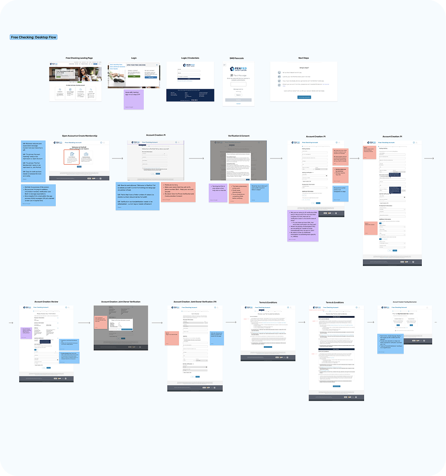
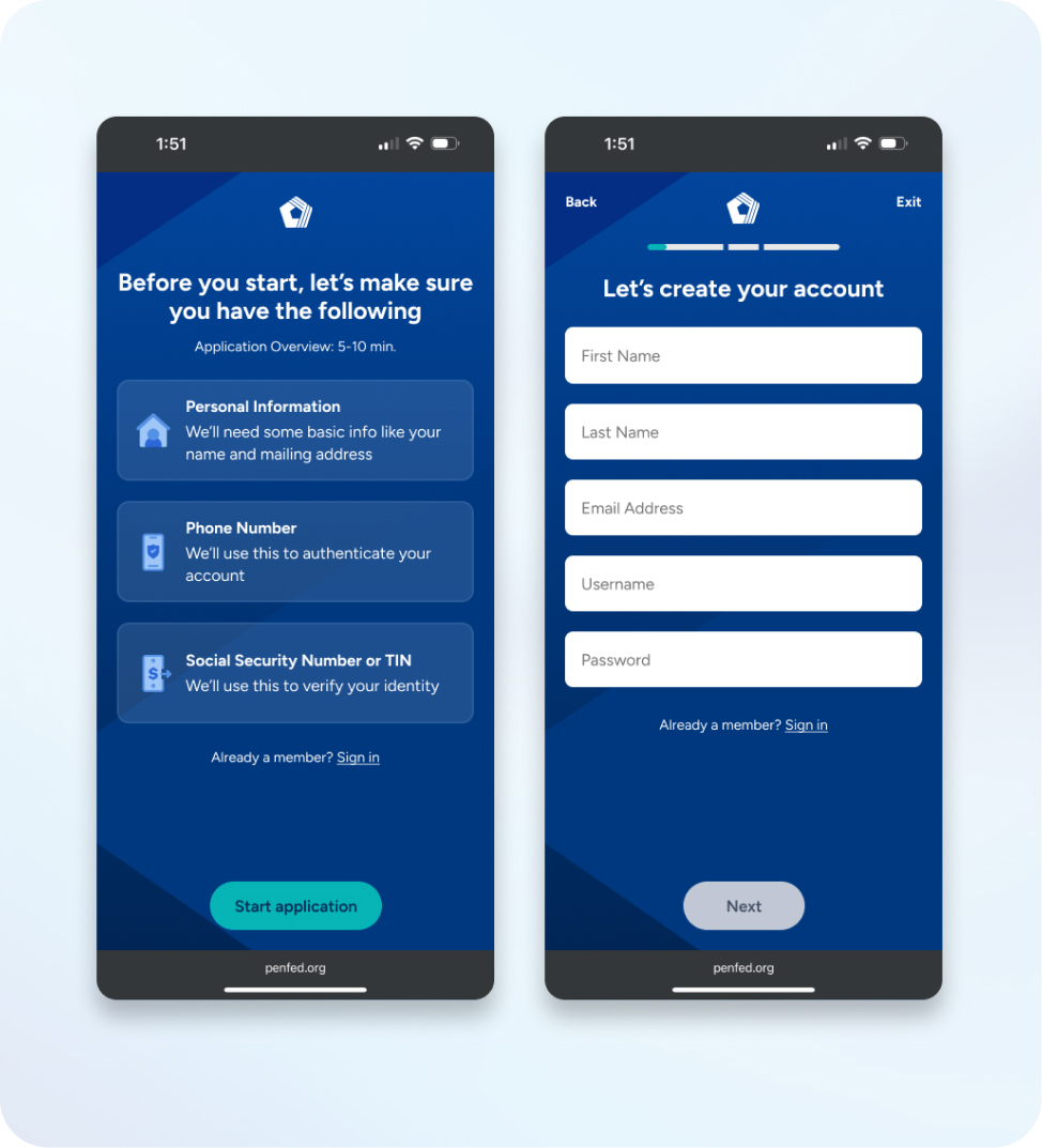
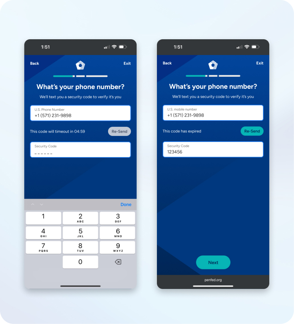
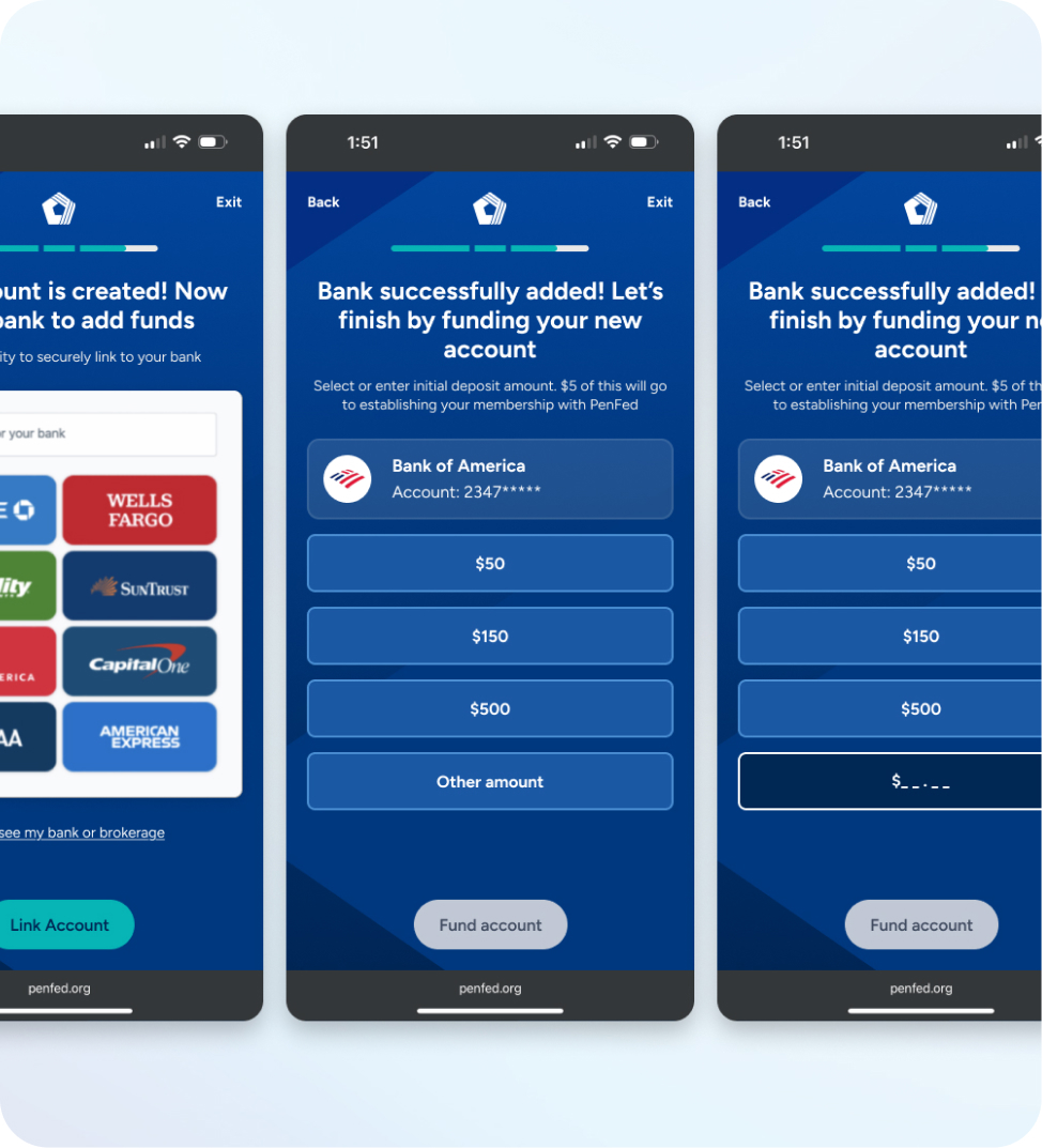
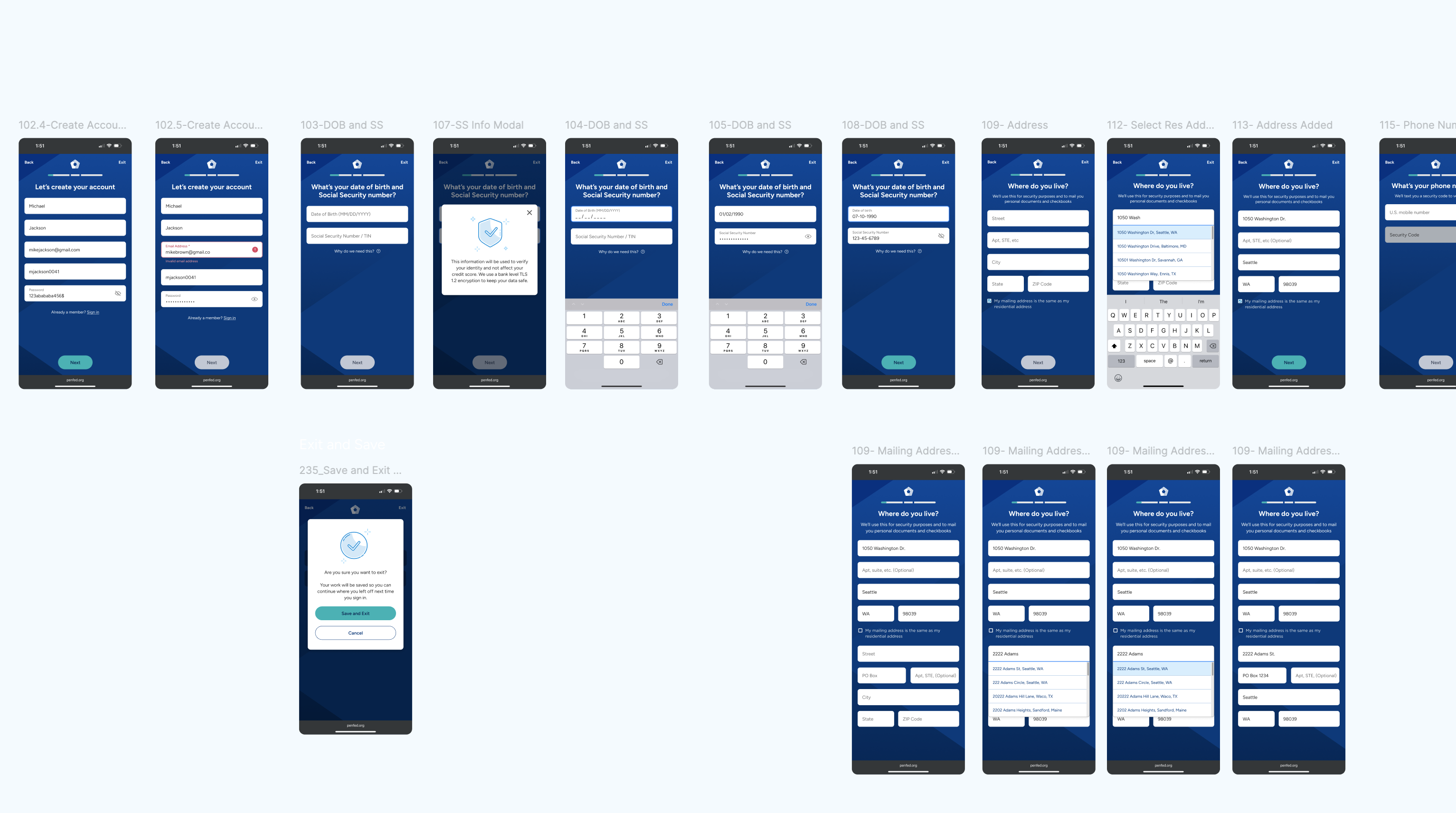
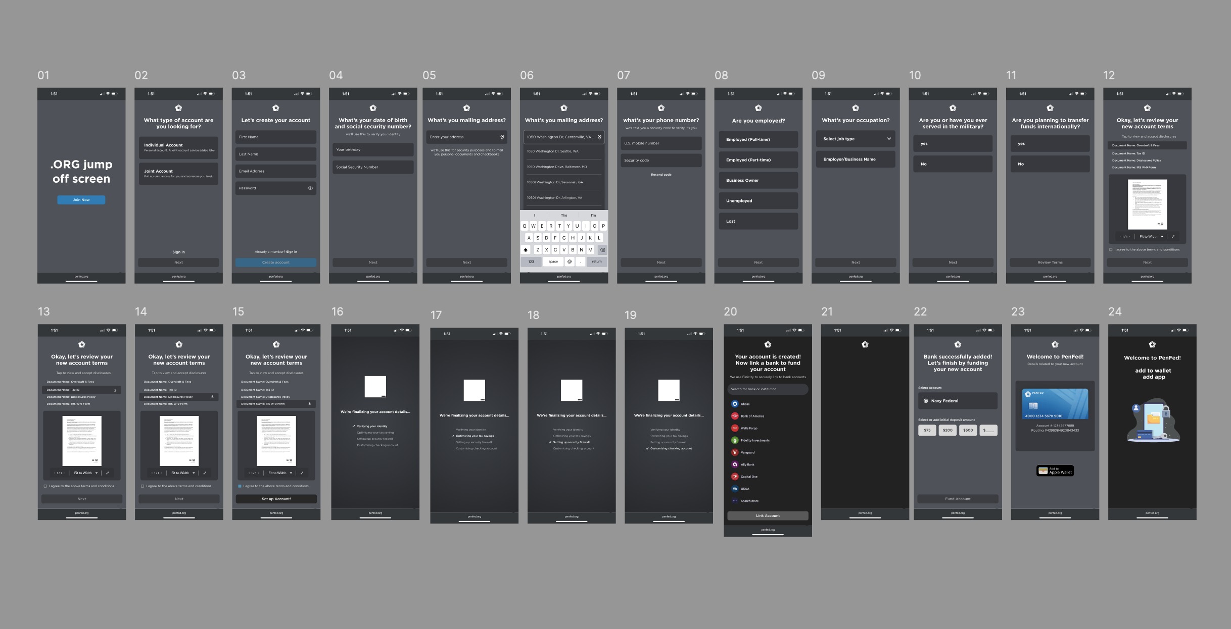
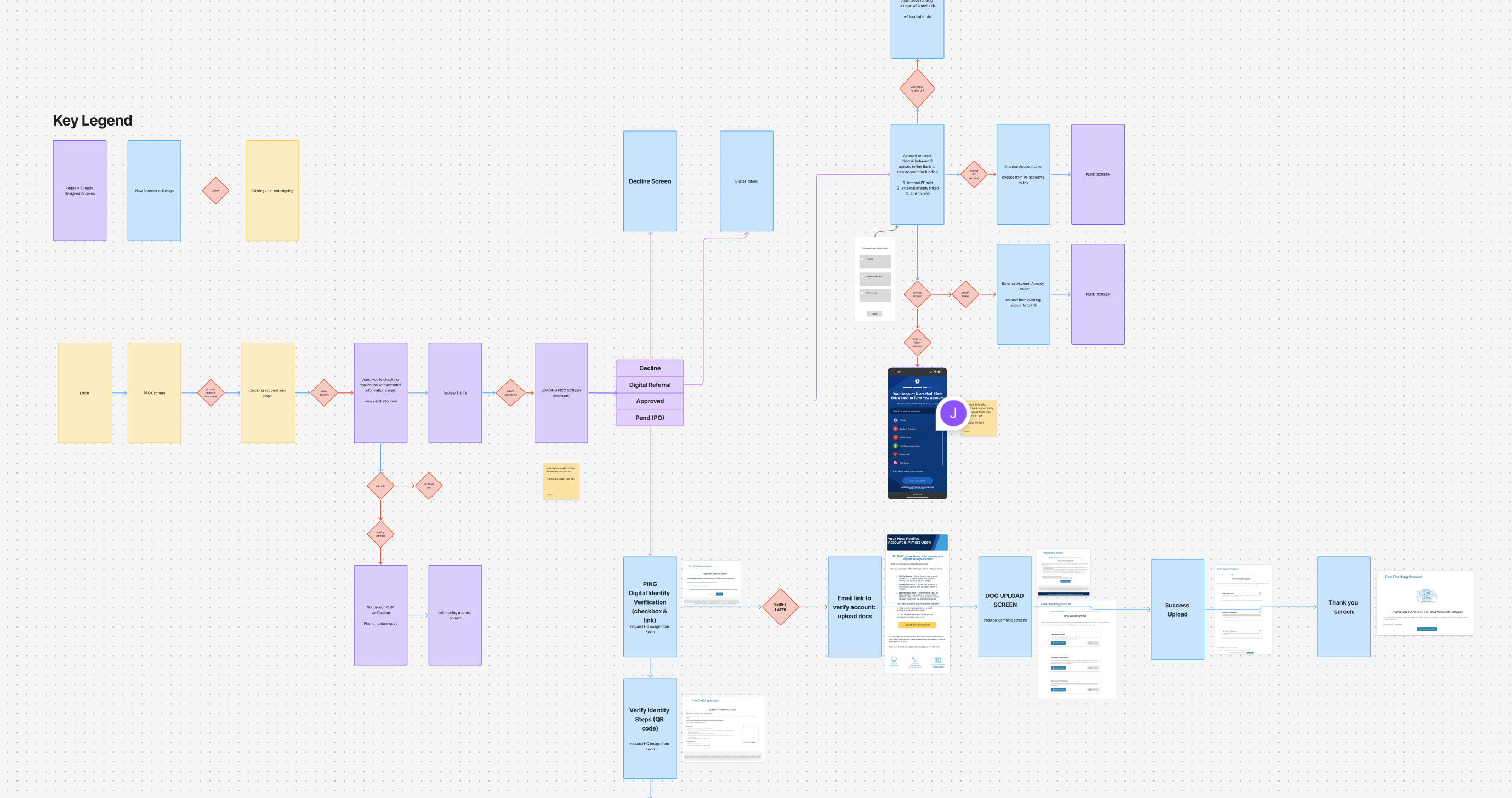
Designing A Unified Framework
To address inconsistencies across product lines and platforms, I created a single scalable onboarding architecture.

Guided Loading Animations
To combat extreme loading times and reduce user drop offs, I introduced a step by step loading animation for user transparency.
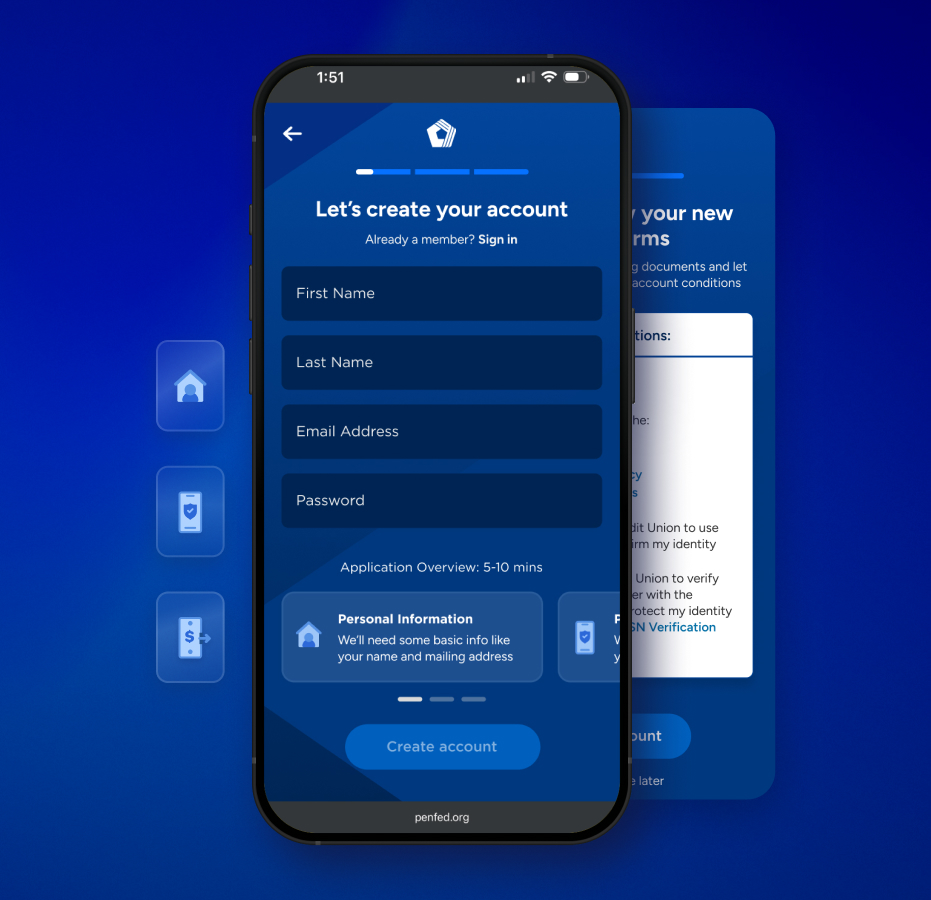
Wireframes & Prototypes
I built low- to high-fidelity prototypes to validate flow sequencing, mobile-first layouts, content clarity, and branching logic.
AI-Assisted Exploration
I've integrated Figma Make into our workflow to accelerate ideation of translating designs into additional product flows. This reduced exploration cycles from weeks to hours.
AI was used to:

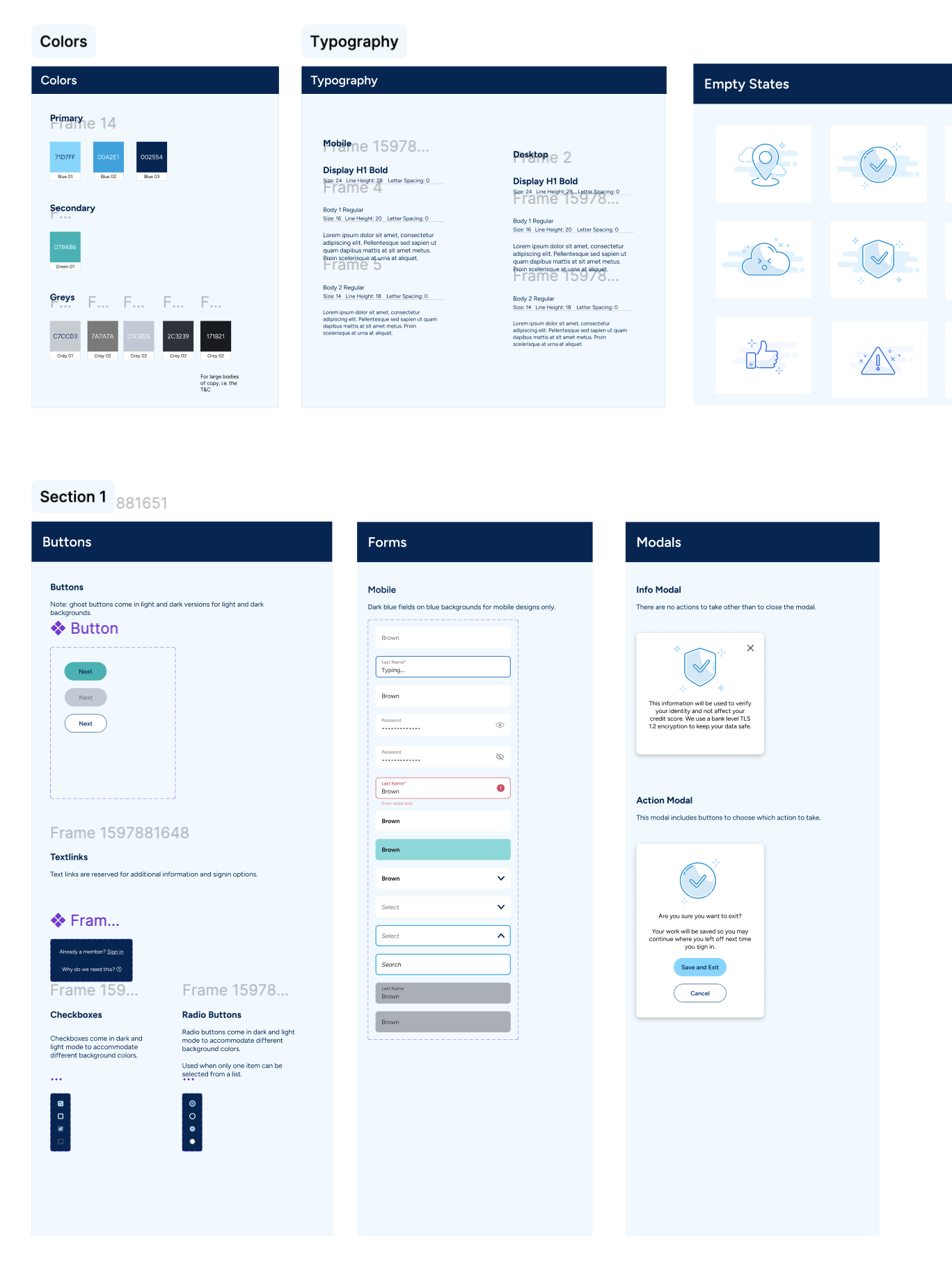
Design System
Created foundational components:
Documentation & Confluence Boards
